The Simpson’s Paradox is one of the most well-known paradoxes in statistics. A quick google will find plenty of blog posts (many from the data science community) about this puzzling phenomenon. It is clearly a topic of real-world significance. There seem to be some important lessons that we are supposed to learn from it. But what are those lessons? Is it nothing more than a cautionary tale about how easy it is for data analyses to go wrong?
Today I followed a footnote in a book about causality, which led me to a short paper titled The Simpson’s paradox unraveled (Hernán et al., 2011). This is one of the papers that I feel compelled to talk about with any random person that I run into, because it explains a complicated topic elegantly, and says something interesting, and maybe even profound, to… well, any random person. You should read this paper yourself because it’s short and accessible, but since I haven’t actually met any random person today, let me explain it in my own way.
The Simpson’s Paradox - the TL;DR version
Wikipedia’s entry on the Simpson’s Paradox suggests that the term is used loosely to refer to situations where one finds a significant relationship between two (or more) variables in a dataset, but the relationship disappears or goes into the opposite direction, when the same procedure is used on subsets of the dataset. You might say that if the dataset is inhomogeneous, it isn’t too shocking that a subset of the dataset does not reflect all the characteristics of the entire dataset. But the paradox specifically refers to conditions where no inhomogeneity is apparent. How can the part not agree with the whole, then?
Wikipedia gives a classic real-world example: two treatments for kidney stones (Treatment A and B) were given to a cohort of patients. The researchers examined the effect separately for patients with large kidney stones, and those with small kidney stones. For both groups, Treatment A was found to be more effective than Treatment B. This can only mean that Treatment A is better than B for the whole cohort, right? Amazingly, the same analysis, when applied to the whole dataset, indicated that Treatment B was more effective! How can this be possible? Well… I forgot to mention this tiny little detail: the data didn’t come from a randomized experiment, where patients were randomly assigned to receive Treatment A or B. Instead, the data came from real-world practices where Treatment A were more often proscribed to patients with larger stones. Therefore, the outcome data for Treatment A are dominated by patients with more severe kidney stone problems.
This is a little bit like my next-door neighbor, who seemed to be horrible at the piano because he makes mistakes all the time. This was my impression until I discovered that he only tackles very difficult pieces, precisely because he is pretty good at the piano.
So the kidney stone example turns out to have a clever explanation. But what’s the take-home message? Should we always divide the dataset into smaller subsets? If that’s true, how can we possibly implement this advice? Maybe we could look for indicative characteristics in the dataset, to alert us when the Simpson’s Paradox might be a concern?
The original Simpson’s Paradox
I always felt that most of the non-specialist discussions on the Simpson’s Paradox are missing something. Luckily, Hernán et al. (2011) explains how the main message of E. H. Simpson’s original 1951 paper has become obscured by subsequent commentaries and expositions. This is because the technical part of the paper seems pretty esoteric by our modern perspective [1]. But let us ignore that and focus on the big picture.
First, the original Simpson’s Paradox was more like a thought experiment than a real-world phenomenon. To argue a theoretical point, Simpson constructed an artificial dataset with three binary attributes: A, B, and C. A statistical measure between A and B indicated no association. However, when the data was divided into a C=0 and a C=1 subset, the same measure detected an association between A and B in both subsets. This is very similar to what we have seen in the previous section, except that Simpson’s example was stronger, requiring the two subsets to be perfectly homogeneous according to the association measure. Again, we have to decide if the analysis should be performed based on the whole dataset or the subsets. (A is associated with B if the value of B changes the distribution of A).
What Simpson did next is where things become very interesting: He invited us to imagine two scenarios where this data might come from. In Scenario #1, each item in the dataset represents a poker card found scattered in a baby’s playroom. There are 52 cards in a deck, so we have 52 items in the dataset. Here, A represents the type of card (1: plain; 0: court), B the card’s color (1: black; 0: red), and C - if the card is dirty. The three variables are not independent because the baby has the strange tendency of making the card dirty if it’s a court card or if it’s red. In this scenario, the conclusion drawn from the whole dataset is the correct one, because we know for a fact that there is no association between a card’s type and its color.
In Scenario #2, A is a medical treatment (1: yes; 0: no), B the outcome (1: died; 0: survived), and C the chromosomic sex of the patient (1: male; 0: female). In this setting, C influences if the treatment is given to a patient (A) and the outcome (B). Using the same logic discussed in the previous section, we can see that this scenario could produce exactly the same data. So, the analysis based on the subsets is the correct one.
The big question was this: the correct analytical procedure to use (i.e., to stratify based on C or not) cannot be determined by the joint-distribution of the three variables, because the dataset for the two scenarios is identical. The only difference is the “meanings” of the variables. Therefore, the knowledge required for making the correct decision is not statistical. Statistics alone is not enough for doing statistics! What is this extra piece of knowledge? How do we formalize this knowledge, if it’s not expressed in the language of statistics?
Paradox? What paradox? The Simpson’s “Paradox” as a gentle introduction to casual graph theory
This non-statistical knowledge seems a little mysterious, but Hernán et al. (2011) explains that the knowledge needed is the casual structures of the variables, which can be formally expressed as graphs. With this knowledge, the paradox is completely resolved.
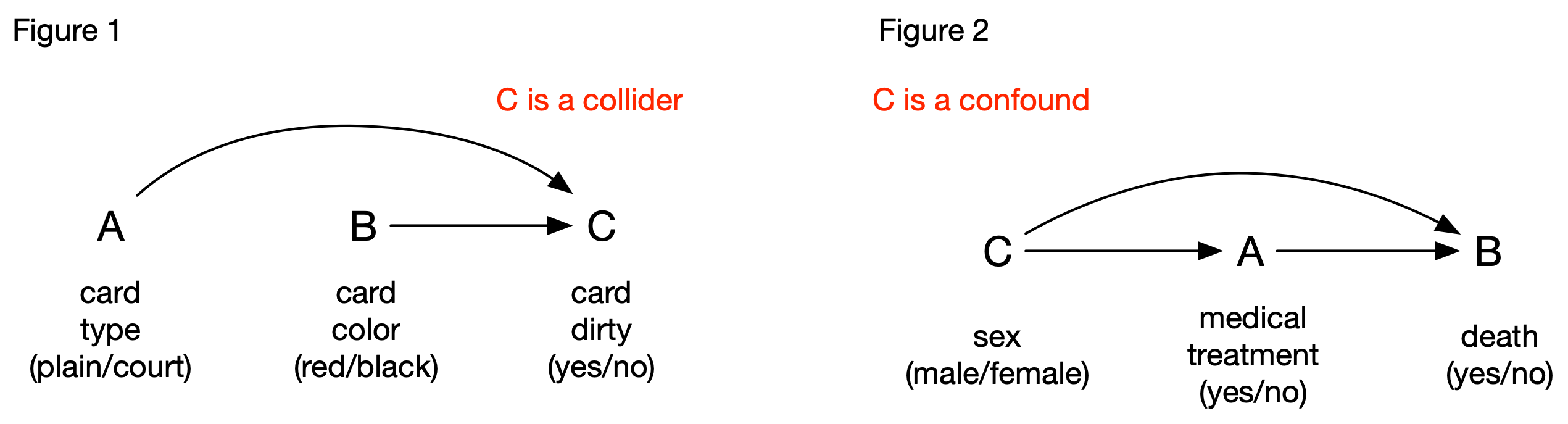
First, consider Scenario #1. Based on our reading of Simpson’s description, we can formalize the casual relationships among the 3 variables as Figure 1. Arrows are drawn from A to C and from B to C, because the baby’s behavior (C) is determined by the card’s two attributes. There is no arrow between A and B because a card’s type does not determine its color. To the uninitiated, this figure doesn’t mean much, but it’s a configuration of central importance to casual graph theory: What it says is that if you are wondering if C should be considered in your analysis of A and B, don’t be. Ignore it. This is because C is the common effect of A and B (in the colorful jargon of casual graph theory, it’s called a “collider” because the two arrows collide on C). The collider C is a welcome feature in the graph, because it doesn’t introduce additional association between A and B, despite the fact that it is connected to the two.
Causal graph theory also explains why dividing the dataset based on C is a mistake: by conditioning on C, the pathway between A and B becomes “unblocked” (i.e., C no longer works as a collider), and can introduce association between A and B when none exists. This type of mistake is referred to as introducing a selection bias [2].
Let’s move on to Scenario #2. In this scenario, the casual relationships among the three variables are different (see Figure 2): C (the sex of the patient) is now the common cause between A and B rather than the common effect. In the jargon of casual graph theory, C is a confound, which can introduce additional association between A and B, so its effect must be removed if we want to know if A has any causal effect on B. Several techniques can be used, and stratifying on C (i.e., calculating the association between A and B for the two levels of C) is one of them. This explains why we should base our conclusion on the subsets for Scenario #2, and on the whole for Scenario #1.
Although Simpson wrote his paper before casual graph theory was developed, it nonetheless provides a simple example that contrasts two key structures in the theory. It is very helpful as a thinking tool for learning causal graph theory.
The lessons of Simpson
So, what have we learned so far?
When examining the relationship between two variables, it’s not always a good idea to divide the dataset into subsets. Stratifying on the wrong variable(s) can lead to selection bias (Scenario #1)
However, there are situations where taking other variables into account is required to remove the potential effects of confounds (Scenario #2). This can be accomplished by stratification, or by other adjustment techniques.
To stratify or not to stratify? This is interestingly not a statistical question. Rather, it depends on our prior knowledge about the causal relationships among the variables. No statistical package can make a definitive decision for you [3].
Although casual graph theory is typically considered a specialized topic, it can inform even the most basic forms of data analyses. It should be considered essential in the training of scientists and data scientists.
Working with data is hard. But you already know that.
“Data never speak for themselves…”
“Data never speak for themselves. They have to be interpreted”. It’s an often-heard cliché. Simpson gave one of the earliest formal arguments that highlight the limitations of statistics.
As someone who claims to hate statistics, Simpson’s main message, that statistics alone cannot derive knowledge from data, is music to my ear. This is why we don’t let statistics be the judge of science[4] or the main driver of science, my statistics-worshiping friends. But it shouldn’t be shocking to anyone. In actual practice, I have yet to meet any statistician who doesn’t incorporate prior knowledge to guide data analysis. Furthermore, it shouldn’t surprise anyone that to make progress in science, we have to actually do science - formulate theories, build models, make predictions, conduct experiments, and all that. It’s never just number crunching.
It’s only a problem when AI/machine learning enthusiasts take their passion for data too far; when they start to dream about a future where insights about nature, human behavior, or business values are gained largely by general-purpose algorithms applied to large volumes of data. That is where we have to step back and think hard about the Simpson’s Paradox and the mathematics of causality. Again, this shouldn’t be shocking to most data scientists, because model designs are almost always guided by domain knowledge. Casual graph theory merely provides a more formal guidance for the process, and it highlights the importance of recognizing designing and conducting experiments as an integral component of data science. This is already a reality in some practices (it goes without saying that in science, it is the norm).
Notes
As pointed out in Hernán et al. (2011), a problem in Simpson’s original paper is that his example was not entirely convincing: the particular measure of association that he used, the odds ratio, has certain mathematical properties that weakened his argument. This has led to a very different interpretation of the Simpson’s Paradox. I have ignored this issue completely in this post.
The selection bias is a common pitfall in reasoning. One particular form of this bias, the survival bias, can be found everywhere. Wikipedia’s entry gives many amusing/alarming examples. These two terms can be explained intuitively, but casual graph theory provides a method for depicting their underlying casual structure.
The keyword here is definitive. There are ways for statistics to provide useful, albeit not definitive, guidance.
I TA’ed for a Psychology professor, who always started his undergrad statistics class with that analogy.