It has become very obvious that extreme weather is a clear and present danger. Globally, 2023 was the hottest year ever recorded, and some scientists are predicting that 2024 will be humanity’s first year beyond the 1.5°C threshold above pre-industrial average temperature. On a personal level, just last week, my house in Melbourne was without power for more than 8 hours, due to a large-scale blackout in Victoria caused by strong winds and high temperatures. More shockingly, two days ago (18 February 2024), Carnarvon in Western Australia experienced a 49.9°C day, which is said to be the world’s hottest temperature recorded this year (as of Feb 2024).
All of us know intuitively that the 49.9°C temperature was very unusual, but can we quantify how unexpected it was? In this article, I will try to answer this question with the help of a branch of statistics called Extreme Value Theory, which is all about the extremes.
Extreme Value Theory has been considered a highly specialized topic in statistics. It’s seldom covered in introductory-level statistics classes. However, given the high level of unpredictability that we are facing, I think it’s a good time to present this topic in an accessible way so that everybody can develop the basic concepts and vocabulary to reason and communicate about extreme events.
What does “extreme” mean? It’s not just very low probability
The word extreme has become a familiar one in news headlines. What does it mean? Does it simply mean a very low probability? Let me be clear up front that the word does not have a single meaning. Depending on the context, it can mean different things. In many situations, extreme events can indeed refer to events that are very unlikely to happen. However, in this article, we’ll be thinking about the extremes from a different perspective. Under Extreme Value Theory, the extreme is defined as the largest value in a fixed block of measures [1]. For example, the highest wind speed of a certain location in a year - that is the annual extreme in wind speed. Similarly, the highest temperature measured by a weather station in a year, the highest number of burgers served in a day in a fast food restaurant, the highest payoff of a casino in a year, the longest waiting time for a customer service call in a year… these are all extremes.
Why are we emphasizing this particular definition, rather than on events of low probabilities? One reason is that if the extremes are defined as events with very low probabilities, we’ll have to decide how low the probability has to be considered extreme. That is not always easy. The definition that we use here bypasses that issue. We would still want to know the probability of the extreme reaching a certain level, so in the end, we’ll still be calculating probabilities, but we won’t argue what counts as extremes [2].
Let’s make this more concrete: the extreme of Melbourne temperature in 2025 (i.e., the highest temperature that will be recorded in the entire year of 2025) is unknown, but we want to infer the probability that the extreme will be as high as 45°C. That is the type of question that we’ll try to answer in this article.
There is a second motivation for this block maximum definition: we often want to estimate the risk associated with extreme conditions within a block of measures, because investments for safeguarding them are typically allocated, not continuously but in blocks. It’s therefore useful that the extreme in this definition is relative to a certain block (typically a time frame) of interest. For example, if a wind turbine is designed to operate for 10 years, we’d want to know the highest wind speed in 10 years.
Why do we need a theory for the extreme?
Why is there a theory about extreme events? Isn’t the statistics that we learn in college general enough? The fundamental reason is that although many people are comfortable with associating a probability with an event, we typically don’t have a good intuition about the probability of the maximum in a block. For example, I have been living in Melbourne for many years. Given a day, I more or less have some idea about the weather (Melbourne is infamous for its unpredictable weather, but I am not completely clueless). However, when I plotted the distribution of the annual maximum temperature, I was still puzzled. Even the shape of the distribution appeared to be unexpected.
The reason why we need Extreme Value Theory is that the statistical distribution of the extreme has its particular flavor. Most people are not aware of this fact, because we tend to assume that the distribution of the extreme has the same shape of the distribution of non-extreme events, just narrower and moved to the right.
We’ll see more examples in the coming sections, but you can experience this mathematical fact in a fun way. If you roll a die, what is the probability of getting a 6? It’s 1/6. It’s a uniform distribution, so the probability of getting any value from 1 to 6 is 1/6. However, if you roll two dice, and take the maximum of the two, what is the probability of getting a 6? It’s about 1/3. I encourage you to try this yourself because you’d be surprised by how often you get a 6 [3]. The distributions are plotted below:
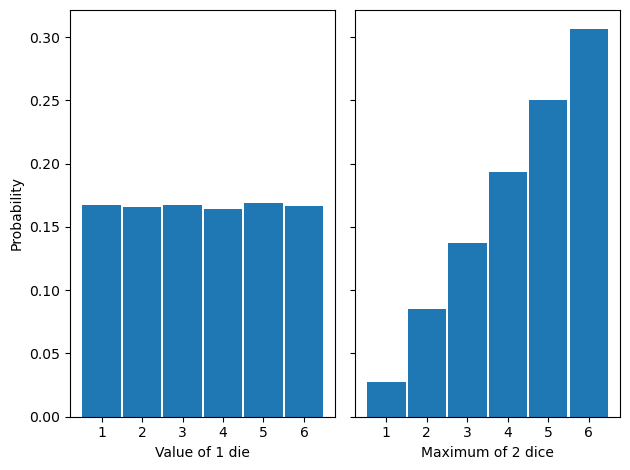
The uniform distribution on the left has been turned into an increasing function on the right. It’s not too difficult to understand why the extreme of the two dice would have a distribution of the shape plotted on the right, but for more complicated cases, we need to turn to Extreme Value Theory. Let’s see a real-world example.
Modeling the extreme requires a specialized family of statistical distributions
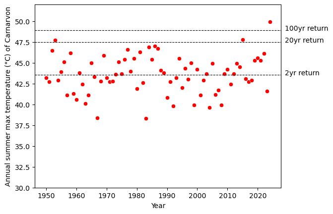
From the Bureau of Meteorology of the Australian Government, I downloaded over 50 years of temperature data of Carnarvon [4]. In the figure below, I took the data just for the summer season (December, January, and February) and plotted the empirical distribution of daily maximum temperature (top) and annual maximum temperature (below). Both are distributions of extreme events, except that they are plotted in two different time scales of interest.
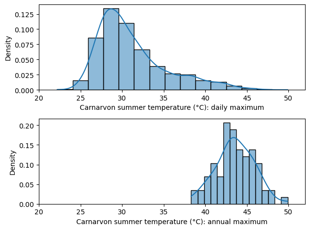
First, observe the shapes. The distribution on the top is clearly not a Normal distribution, but it’s not obvious if the one on the bottom is normally distributed. Statistical tests did not indicate a violation of normality (p-value = 0.95 according to scipy.stats.normaltest), although the small number of samples (N = 75) might make it difficult to detect any deviations (sample kurtosis is -0.026, which is not quite the kurtosis = 3 that we expect from the Normal distribution).
In addition, note that the two distributions have very different shapes. This reinforces the observation we made in the previous section: depending on the size of the block, the distribution of the extreme can be very different. They are not just the shifted or scaled version of each other.
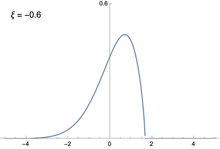
The shapes of the two histograms above are not arbitrary. Extreme Value Theory shows that with enough samples, the distribution of block maximum can be approximated by a family of functions called the Generalized Extreme Value (GEV) distribution. Unlike the Normal distribution, which always has the familiar bell-curve shape, the shape of the GEV distribution is determined by the shape parameter ξ. The following animation illustrates the density function of the GEV distribution, given different ξ. You can verify yourself that the two distributions illustrated in the figure above are indeed approximated by GEV distributions with appropriate ξ.
To see the significance of the GEV distribution, recall why the Normal distribution is so important in classical inferential statistics. The Central Limit Theorem states (roughly) that the mean of a large number of random variables, which might not be Normally distributed, can be approximated by the Normal distribution. The implication is that as long as we are studying the average of samples, the Normal distribution is universally applicable. But if it’s the maximum, rather than the mean, that we are after, we need to use the GEV distribution.
Before we move on to fitting the GEV distribution to temperature data, I think it’s worthwhile to say a few more things about the distribution, because we can gain some important insights about the nature of extremes. First, if ξ is negative, the function is bounded from above, meaning that for values larger than a certain bound, the probability is 0. Likewise, if ξ is positive, the distribution is bounded below. This is very different from the Normal distribution, whose density is never 0. The only unbounded GEV is when ξ = 0. This is the distribution of the maximum of identically distributed Normal variables. Interestingly, the block maximum of Normal variables is not Normally distributed.
The GEV distribution has 3 parameters. In addition to the shape parameter ξ, the other two parameters are the location and the scale parameter. They are similar to the mean and variance of the Normal distribution.
The 2024 summer of Carnarvon has been unprecedentedly hot
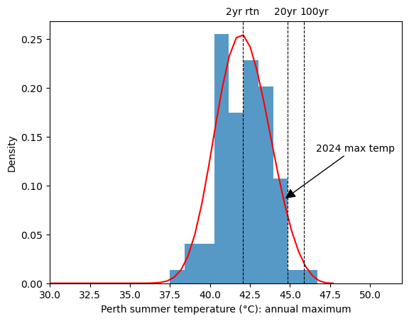
I used the extRemes package for R to fit a GEV distribution to the annual maximum temperature data from Carnarvon. The fitted parameters are (42.75, 2.26, -0.253) for the (location, scale, shape) parameters [5]. It’s a function slightly skewed toward the right. The density function is plotted below in red:
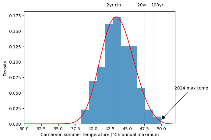
We can see that the 49.9°C maximum temperature of 2024 is at the very right end of the distribution. How unlikely was it? In the vocabulary of Extreme Value Theorem, probabilities are very often reported in terms of “return level”, which is just a more intuitive way to express percentiles. Since 1 data point in the dataset represents the maximum of a year, the 50% percentile is the temperature expected to be exceeded in 1 year out of two years. Likewise, the 95% percentile is the temperature expected to be exceeded in 1 year out of 20 years, and the 99% percentile is the temperature expected to be exceeded in one year out of 100 years. It’s important to remember that return levels in this context are summary statistics of the historical data. They are not forecasts of the future.
The estimated 2-year, 20-year, and 100-year return values are tabulated below. I have also plotted the mean estimates as dotted vertical lines in the figure above.
| Return level | 95% lower CI | Estimated | 95% upper CI |
|---|---|---|---|
| 2 year | 42.98 | 43.54 | 44.11 |
| 20 year | 46.71 | 47.47 | 48.22 |
| 100 year | 47.84 | 48.89 | 49.94 |
This table tells us how unexpected the 49.9°C recorded on 18 February 2024 was: It’s 1°C above the estimated 100-year return level (!), and it is barely within the 95% confidence interval of the estimate. The plot below illustrates that this record is unprecedented in history.
The 2024 summer of Perth has been the hottest in decades
Carnarvon is a small town in Western Australia with a population of 4,000. It is about 900 kilometers from Perth, the capital city of Western Australia. For comparison, we can also take a look at the temperatures of Perth [6]. The parameters of the fitted GEV distribution are (location, scale, shape) = (41.47, 1.62, -0.26).
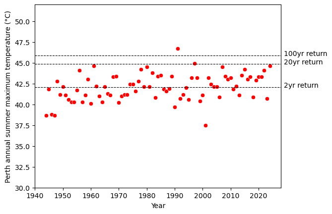
The two figures above suggest that the summer of 2024 was scorchingly hot in Perth - the maximum temperature (44.6°C) was slightly below the 20-year return level, ranking 3rd in this 80+ years dataset. However, it was not unprecedented. The hottest temperature in this dataset was the 46.7°C of 1991. The 46.7°C record was above the 95% upper confidence interval of the 100-year return level, so we might say that the temperature of 1991 was perhaps as unexpected as the 49.9°C of Carnarvon 2024.
| Return level | 95% lower CI | Estimated | 95% upper CI |
|---|---|---|---|
| 2 year | 41.65 | 42.04 | 42.42 |
| 20 year | 44.34 | 44.84 | 44.35 |
| 100 year | 45.19 | 45.85 | 46.51 |
The annual maximum was not the only way in which weather can be extreme. To quantify the accumulative effects of consecutive hot days, I calculated the median temperature of a 4-day rolling window and then calculated the annual maximum of each summer.
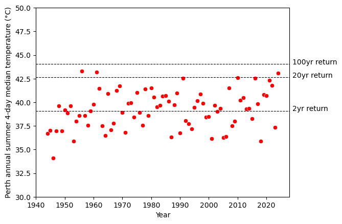
The value of this 4-day median in 2024 (43.1°C) is between the 20-year and the 100-year return level (42.6°C and 44.0°C respectively), suggesting that the residents of Perth endured a rare summer heatwave. The last time anything like this happened was more than half a century ago.
Final thoughts
We have barely scratched the surface of Extreme Value Theory. The most obvious issue with the analyses presented above is that we reduced an entire year worth of data to just one data point, before we fit the data to the GEV distribution. In doing so, we have ignored any pattern in a year that might inform us about the extremes. In datasets with very long history, it might be fine, or even desirable, to operate at the annual level; but very often, it would be very useful to take advantage of the daily resolution of the dataset. Making inferencing about the extremes at different scales is an important part of the theory (among others) that is not covered in this article. I hope that you’ll find this article interesting enough to go deeper into Extreme Value Theory.
Notes
[1] Extreme Value Theory is not all about the maximum. It can also deal with the second-largest value, the third-largest value… and so on. It can deal with the minimum as well. But for simplicity, we’ll limit ourselves to the maximum here.
[2] The words that we choose to use when we reason and communicate about extremes are important. It’s easy to use a language that does not correspond to the statistical concepts. For example, I am familiar with the definition of extreme used in this article, but when I started this article, I still gave it the title “How extreme is it?” It’s hard to resist using this title because it’s short and easy to understand, but according to our definition, it’s not meaningful. We can ask “How unexpected is the extreme being 49.9°C?”, but we cannot ask “How extreme is 49.9°C?”
[3] The fact that taking the maximum of two dice gives you a biased die can be very useful for tabletop games. I have played a game that uses this trick to allow the player to move 6 squares more often than 1 square.
[4] The data was taken from the Carnarvon Airport. The data before 1950 appeared to be unreliable, so I decided to exclude them from this analysis. I chose not to filter the data with the “Quality” column in the dataset.
[5] The skewness of the fitted distribution is 0.0776034, indicating that the tail is on the side of high temperature. Excessive kurtosis is -0.257, which is also a slight deviation from the Normal distribution.
[6] The dataset used was from the Perth Airport rather than from the metropolitan area of Perth because the Perth Airport has a very complete set of historical readings.